
When my job was advertised last year, it included an aspect that wasn't there when I first won the position back in 2011, that of Student Data Management. It evolved to be a part of my role over a couple of years, in line with the development of our own Student Achievement Data System. We started this back in 2012 under the guidance of our then Primary Years Head of School who figured that as our system was a glorified spreadsheet, it was better that the person in charge of ICT (me) should be responsible for it. It's grown from there and we track a lot of data now, and have student data spreading over a 3 year period that can be analysed and used to drive classroom decisions about learning programs. For us, data is a tool.
I didn't always see data in this way. I tended to see it as a weapon used by governments and departments to drive compliance - and there is much truth in that viewpoint. But being responsible at my school has given me an insight into understanding the various measurement systems that have been set up to map student achievement and how to look for patterns and trends. It has helped me to sort out some of the hyperbole that the media likes to use when bending data to tell the stories of woe and under achievement within our schools, and to see how presenting data in certain ways can spin the story that it tells.
Here's one trick that I noticed with NAPLAN results either sent out to schools or shown in the media. Check this fictional graph with some fictional NAPLAN scores: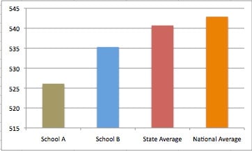
Notice how the difference in scores really show out here. School A and even School B should be really alarmed at this extremely worrying results! But the graph only focuses on the very tip of the measurement scale. Rescale the graph to show from 0 - 550, and this is what can be seen:
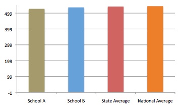
All of a sudden those differences at the top don't look so drastic. So, how the data is presented to the viewer can really sway their interpretation of that data. And if you had a hundred schools lined up like this in a graph, you might struggle to tell the low achievers from the high - it is why a league table can also skew perspective, and make a school look like it is failing when in reality, it might only be a few points away from matching those ranked up in the upper echelon.
So, when I pull together graphs for the staff to view, I choose to show a whole picture and let them view the differences for themselves. After all, if we want teachers to use data to inform their teaching, they need opportunity to look for the patterns for themselves. We can set benchmarks as well, but the goal is improvement for all of our students regardless where they sit on the varied achievement scales of the assessment tools commonly used.
I'll leave this post for now but I do want to come back and explore a few of the tools we use for our Data System.
