Our department has announced a commitment to getting schools to use PAT Maths and Reading tools, which our school has already been using for 2 years now. I've had training and as part of my role, I have spent time becoming familiar with the tests, the scoring system and the interpretation of results. Data analysis isn't something that I am naturally talented at and I have to run over things again and again until I am sure that I "get" it. Unfortunately for me, there is no substitute for this repetition as I learn mainly by having a go at things - official training only really points me in the right direction. I simply must play with numbers and results, and look to see patterns that mean something. With all of this in mind, I ran a PD session in the week before school started for interested staff to try and share some of that hard fought for wisdom.
At my school, we use the online PAT system to test the students once a year in Maths from Year 1 to 7, and in Reading Comprehension from Year 3 to 7. Because it is online, students' results are available immediately without the manual scoring workload that was associated with the old paper version. There is a bit of administration work required before hand as I had to enter in all of the students, assign user names and passwords, add tags to sort students by Year Level, class and other key factors (EALD, NEP, ATSI) as required by our school. However, once the tests have been taken, I then take on the role of intermediary to help teachers make sense of and then use of the data gathered. Like most schools, this is only one part of the whole student achievement data picture. We collect lots of other data to inform us about how students, classes and cohorts are travelling in their learning. But each piece requires clarity and understanding in order to ensure that an accurate interpretation takes place.
PAT uses a combination of stanines, percentiles and their own PAT scoring system. Many teachers are puzzled by the concept of stanines but they are not that hard to grasp. Stanine is an abbreviation of "standard nine" where students score fall into a Stanine from 1 to 9, with 1 being the lowest and 9 the highest. Generally, students don't progress from one stanine to another - they are moving goal posts that sit aside a calculated mean score for each year level. This calculated mean (generated by thousands of PAT scores) tracks the mythical "average" student and outlines what "typical" growth over the years should look like. Don't get me wrong, students can and do move from one stanine to another, but this movement is more likely to show an unusual gain or decline that will require further analysis. Generally, if a student has a stanine between 4 and 6, then they fall within the average range with the bell curve being in statistical effect meaning that over half of students should fall into this range. Stanine 1 -3 indicates where students who have learning difficulties or learning gaps are, and helps to flag possible learning intervention, while 7-9 is the realm of the highly capable to gifted students. Statistically, these two groups contain the same number of students - 23 % at either end. Percentiles also can be used to peg out these levels but stanines seems to be more manageable as a concept.
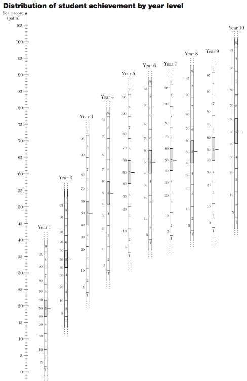 The PAT score is different, and is the way progress is measured. The Maths scale doesn't line up with the Reading scale but they both operate in the same manner. This can be seen on the Scale PDFs (shown right) that come with a school subscription. You can see how the PAT score runs up the left hand side of the chart while the stanines shift their way across the year levels. So every score can be read across the diagram, and you can determine if this means the students falls into the average range, or has low or high achievement. When you have multiple scores for an individual, you can use the chart to map out their progress and some determination can be made about whether they are tracking as expected, making better than anticipated gains or whether progress has slowed.
However, for some teachers, this chart feels like information overload and they just are not confident enough with the scales and how they connect to the stanines to really be sure of what they are looking at. Here's where I have made an attempt to simplify and clarify. One thing I did to aid their understanding was to annotate the median point in Stanine 5 across the year levels to show them as moving goalposts, while pointing out that progress is measured by the PAT scale.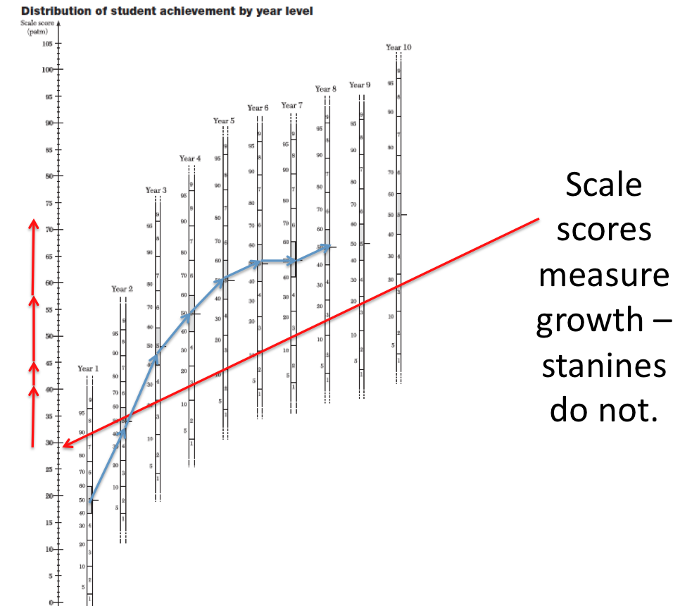
This was helpful for most but a conversation between our special education team and a frustrated teacher lead to a simpler version that I will share next. This teacher had her class data in our school WGLADS spreadsheet but pointed out that the number for either PAT result didn't really mean anything to her. I remembered that we have introduced a colour coding system into that spreadsheet where NAPLAN bands, PAT stanines and report grades were given a simple colour system. Blue meant high achievement (as in blue ribbon!!), amber meant an alert for underachievement or learning difficulties while results left uncoloured fell within the average or acceptable range. When doing a simple filter on a class, the students can be seen to fall into these three rough categories as a starting point for addressing the learning needs of the class. So, I thought adding the colours in on the stanine segments would help a teacher at a glance determine where a result sat in the range of potential achievement. The teacher also found it hard to relate to the percentile figures (which a data lover like myself has no issue with) so I stripped them out as well. I added in red lines across the page to make it easier to read a score across the year levels. A print out of this or using digital markup tools would make it an easy exercise to map out a student achievement history, and make some determination about whether appropriate progress was being made.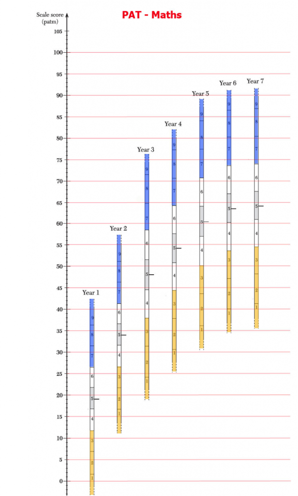
Getting teachers to engage with this data is a pretty big step, and the easier and more palatable I can make it, the more they will seek to use it in a meaningful way. I don't want staff thinking that PAT data is super mysterious or that you need be some sort of assessment geek to make sense of it all. Use the tools provided and the teacher can see where the class sits at that point in time. If they them wish to drill down more deeply into the individual student's results, they can do so in the Report generation mode within the ACER PAT website. The tools in here enable the teacher a more detailed view of how a student is handling different aspects of the subject being tested. The website also gives you access to some handy videos that explain the various aspects of the PAT system in an easy to understand way, and importantly, they take the time to remind educators that this is only a snapshot in time, and that student achievement needs to be evaluated through an array of assessment and evidence. A test like this should confirm and provide evidence for what a teacher already knows - but it is not surprising that it can sometimes reveal things that can be masked in the classroom. As an example we had a Year 2 student who we believed was quite capable but was not always focussed in his maths lessons. The teacher was unsure whether he really understood the learning or was just coasting. After he aced the Year 2 Maths test, blitzing it without any requests for help, and scoring in the 99th percentile (only 1 % of all Year 2 students would be higher than him), it was clear that he needed more challenge. This was confirmation that was very useful for the school to know and bear in mind moving forward.
I hope this post helps a few people who may be still coming to terms with PAT. I am no expert so feel free to correct any errors or misinterpretations you may find. I'd like to thank ACER for giving me permission to post their copyrighted material, and my alterations of that material. There is much more I could cover but nothing beats hands on use of real student data and results, so don't be scared about digging deep and seeing if my observations help to shed some light on this particular assessment system.